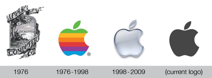
The final form of any brand logo is hypersimplicity
“Can an illiterate child draw it from memory?”
I’m a writer, not a visual designer. But I have always been very particular about visuals.
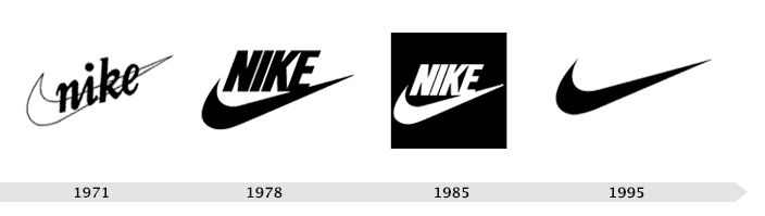
Nike colonized a tick.
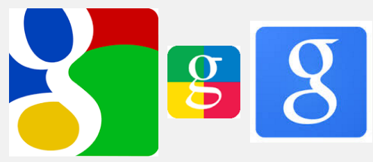
Google colonized a circle with a line.
You want a logo that anybody can draw and identify. If a child who doesn’t speak English can draw a recognizable version of your logo, you’re golden.
McDonald’s comes next with the golden M — no translation necessary.
Adidas did a good job with the three stripes
Instagram did a killer job with its redesign. It represented a camera with just three strokes:
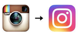
The important thing isn’t the colors, but that it can now be represented so simply:
Facebook F
Chanel C’s
Nazi swastika
Mercedes
HP
Yahoo Y! — Similar to Virgin logo
BBC
Superman
Chevrolet
Star of David
Jesus
Volkswagen
I’m still not sure how I feel about Uber’s redesign.
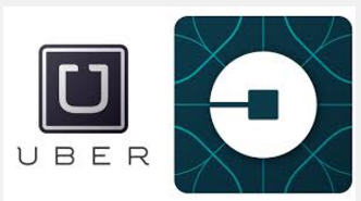
The frills on the outside are redundant and can be removed, that’s a trivial thing. Square within a circle is easy to remember/visualize, but I’m not sure it means anything. Why is the line / hole on the left rather then up (where it would still be “U”)?
I would’ve voted for either of these instead:


Cisco is good

San francisco, bridge, wireless connectivity — genius.
Converse
I like it.
Of course, not all brands need to be hypersimple. Lamborghini, Ferrari, etc probably benefit from having complicated logos and would lose something if they oversimplified it.
Sensual brands like Victoria’s Secret or Lady Godiva or Magnum ice cream — they need their swirls and serifs to convey indulgence. Stripping that away would strip away the sex.
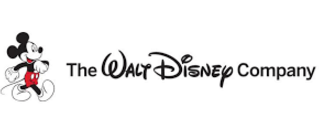
Disney deserves its swirls — it’s a stylized version of Walt Disney’s signature, and it’s very smart to use such an iconic founder’s identity as part of the product. and castle— but their simplicity comes from mickey.
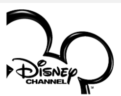
It’s a very clever move of them to put in Mickey Mouse into the “corporate logo”, because it evokes emotions when you look at it:
Ogilvy uses a stylized version of it’s founder’s signature, which is a smart move despite the complexity.
YouTube — the red arrow. Perfect. You can make cushion covers out of it. All sorts of simple merchandise. They colonized a red triangle.
Starbucks — can’t get too simple too fast, but you can see they’ve been progressively simplifying
Could be better: NASA. Way too complicated. There’s a suggested redesign that cuts out too much of the text and makes it hard to read, but the slight
Uber
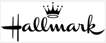
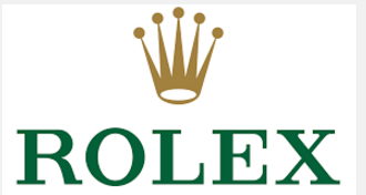
Burger King should exploit their crown. Rolex is currently colonizing the crown space (and Corona, I suppose, but that’s not obvious), and Hallmark.

Good / relevant / related links:
http://www.mcwade.com – Your Logo as a design element (good blog overall, very happy to have discovered)
http://www.theatlantic.com/business/archive/2016/09/the-age-of-the-wordless-logo/499166/ kena a little bit scooped but eh I have more to say